The Wall Where Your Proof Lives
A woman sits in your waiting room, phone in hand, looking at your website's before and after gallery. She isn't reading your bio. She isn't checking your prices. She's doing the one thing every prospective client does when they're close to saying yes: she's looking for herself in someone else's results.
This is the most honest moment on your entire website. No headline can fake it, no testimonial can replace it. Before and after photos on your website are where claims meet evidence — and where trust is either earned or quietly lost.
And yet most galleries get it wrong in the same way: they shout. Grids of harsh clinical close-ups, garish "RESULTS!" banners, mismatched lighting that makes the "after" look like a different person photographed in a different decade. The intent is to impress. The effect is to unsettle.
There's a better way to show your work — one that persuades precisely because it doesn't raise its voice.
Why the Loud Gallery Backfires
Think about how a results wall actually feels to the person viewing it.
A loud gallery treats proof like a sales pitch. It crops tight on a single feature, slaps on an arrow, and stacks twelve of them in a relentless grid. The message your visitor receives isn't "we're skilled" — it's "we're trying very hard to convince you." And the harder a brand tries to convince, the more a careful client wonders what they're compensating for.
There's also a quieter problem. When every image is maximally dramatic, the viewer's brain does what brains do with anything that looks too good: it discounts it. Suspiciously perfect results read as edited, staged, or cherry-picked. The drama you added to impress is the very thing that makes people doubt.
The goal of a before and after gallery isn't to dazzle. It's to let someone recognise themselves in your work — and believe the result is real.
A quiet gallery does the opposite. It presents results the way a confident professional would: calmly, consistently, without theatrics. It assumes the work speaks for itself, because it does. That restraint is itself a signal of competence — the same instinct that makes a clinic's whole website feel like a place you can trust before you've read a word.
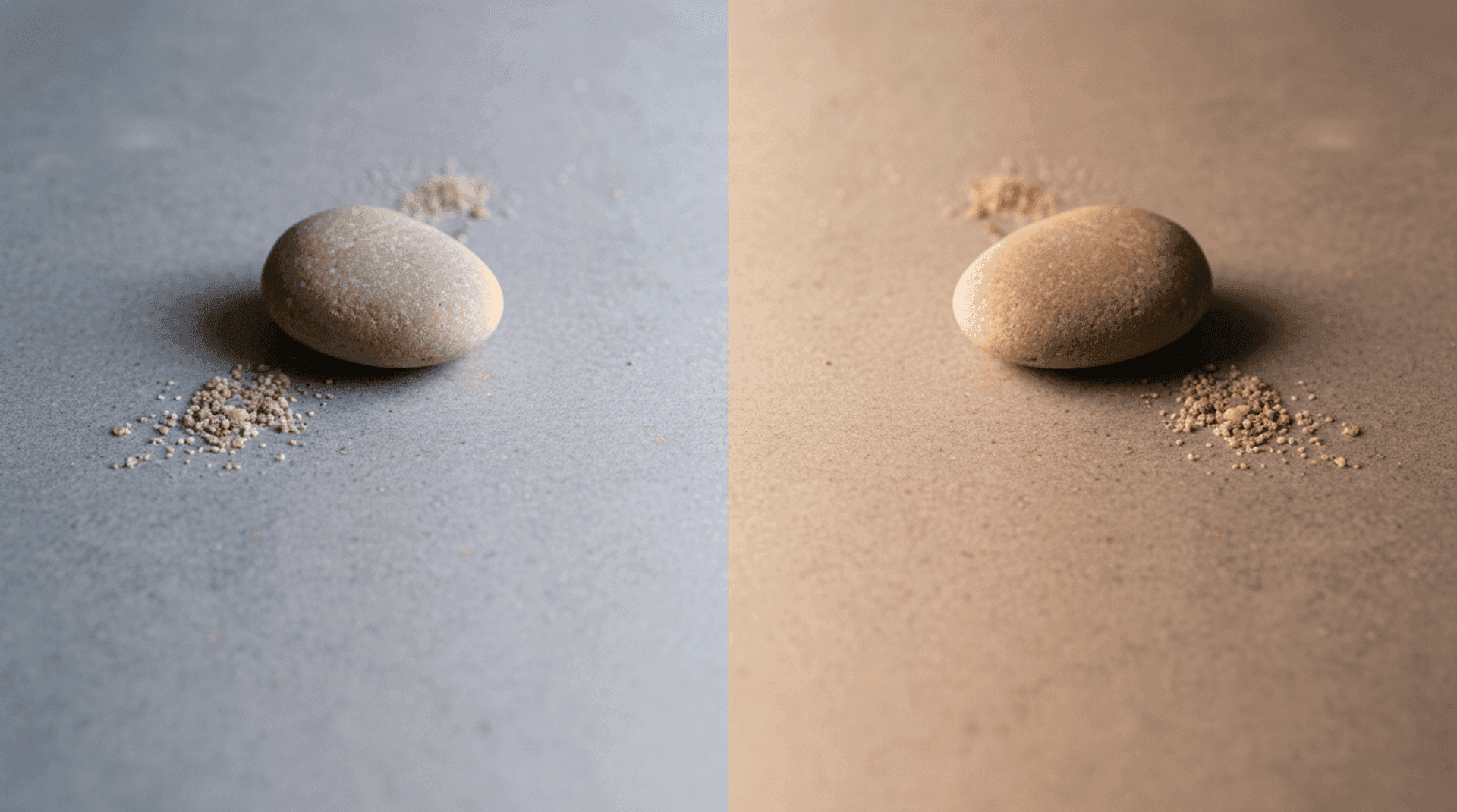
The Science of Believable Proof
For a before and after gallery, this matters enormously. When two photos are shot in the same light, at the same angle, at the same distance, with the same expression — your visitor's brain processes the comparison effortlessly. The only variable left is the result itself. The change reads as real because nothing else is competing for attention.
But when the lighting shifts, the angle tilts, the background changes, or the "after" suddenly has makeup and a blow-dry the "before" didn't — fluency collapses. The viewer's brain has to work to separate the genuine outcome from the production. And the moment they sense they're working that hard, suspicion creeps in. They may not articulate why. They'll just feel that something is off.
Consistency, then, isn't a stylistic preference. It's the mechanism that makes honest results look honest.
Building a Gallery That Earns Trust
Here's how to translate restraint into something you can actually build.
Standardise the conditions, not the people
The single most persuasive thing you can do is photograph every before and after under identical conditions. Same lighting setup. Same camera distance and angle. Same neutral background. Same neutral expression. The client should not have a fresh manicure and styled hair in the "after" if they didn't in the "before."
This is the unglamorous, technical discipline that separates a credible clinic or salon from a flashy one. It's also where a well-designed website helps: a thoughtful gallery layout that places the two images in a consistent frame, at a consistent size, reinforces the comparison your photography already set up. The design shouldn't add drama. It should get out of the way.
Slow the gallery down
Resist the grid of forty thumbnails. A wall of tiny results invites skimming, and skimming flattens everything into noise. Instead, give each case room to breathe — a larger pairing, a sentence of honest context, generous whitespace around it. Let visitors move through a handful of cases deliberately rather than scanning dozens distractedly.
A slider that wipes between the before and after, or a simple side-by-side at a generous size, lets the eye dwell. Quality over quantity isn't just tasteful — it's more convincing. Eight cases shown with care will outperform forty shown as a contact sheet.
Add context, honestly
A result with no context is a magic trick; a result with context is a credential. A short, factual caption — the concern addressed, the approach taken, a realistic note on the timeline — turns an image into evidence. It also manages expectations, which protects both your client and your reputation.
Crucially, be honest about what isn't typical. If a result is exceptional, say so. If individual outcomes vary, say that too. Honesty here doesn't weaken your proof. It strengthens it, because the careful client you most want to attract is exactly the one who notices when a brand is being straight with them. (This is doubly true for salons, where the line between a transformation and a genuine, repeatable craft is what turns a one-time visitor into a regular.)
Treat consent as design, not paperwork
This is non-negotiable, and not only because it's the law. Photographs of identifiable people require explicit, documented, informed consent — and in the EU, the GDPR treats much of this imagery, especially anything that could reveal a health condition or treatment, as a special category of personal data demanding a higher bar of protection. A signed model release should specify exactly where the images may appear, for how long, and the client's right to withdraw.
But consent is also a design consideration. Offer clients real options: full-face, cropped to the treatment area, or fully anonymised. Some of your best results will come from people who'll never agree to a full-face photo, and a gallery that respects that — by being beautiful even when partially cropped — is a gallery that more clients will agree to be part of. Design for dignity, and you'll end up with more proof, not less.
Never let the design lie
Soft, flattering site-wide aesthetics are wonderful — until they touch the gallery itself. A global filter, a warm overlay, an auto-enhance that smooths skin: any of these applied to result photos turns evidence into advertising, and crosses an ethical line in regulated fields like aesthetic medicine. Keep the gallery images clinically faithful. Let your beautiful design live in the frame around the photo, never on the photo.
When You Genuinely Can't Show Faces
Some of the most ethical, most regulated practices can't — or shouldn't — show traditional before and afters at all. That isn't a dead end.
You can show process: the consultation, the care of the space, the instruments, the hands at work. You can show anonymised detail crops. You can let articulate, specific testimonials carry the emotional proof while your craft is conveyed through atmosphere. A gallery's job is to make someone believe in your competence and feel your warmth — and there's more than one honest route to that.
- Standardise every shot — same light, angle, distance, and expression — so the only thing that changes is the result
- Slow it down — a few cases shown with care beat dozens crammed into a grid
- Caption honestly — context turns an image into a credential and sets realistic expectations
- Make consent a feature — offer full-face, cropped, and anonymised options; document everything per GDPR
- Never filter the proof — keep your beautiful design in the frame, never on the result photo
The clinics and salons that win the careful client aren't the ones with the loudest results wall. They're the ones whose proof feels so calm, so consistent, and so honest that there's nothing left to doubt. The work was always good. A gallery done right simply lets it be believed.
At Orpheus Studio, we build galleries that present your finest work with the restraint it deserves — consistent framing, honest context, and consent designed in from the start. If you're ready for a site where your proof speaks quietly and convincingly, let's talk about what we make.

