What a Room Says Before You Speak
Imagine two waiting rooms. In the first, the chairs are crammed against the wall, a TV murmurs in the corner, and a stack of forms slides off the side table. In the second, there's space. One plant. A window with light coming through. Somewhere to put your bag down. You haven't met the therapist in either room yet — but your body has already made up its mind about both.
A calm visual language does the same work, only faster and earlier. For a psychologist or psychotherapist, your website is the first room a prospective client steps into. And the question they're asking — usually without words — is not "is this person qualified?" It's "do I feel safe enough to lower my guard here?"
That question gets answered by design long before it gets answered by your credentials.
Calm Is a Signal, Not a Mood
We tend to treat "calm" as a vague aesthetic preference, like choosing soft colours because they're pretty. But for someone in distress — and many people land on a therapist's website precisely because they're in distress — calm isn't decoration. It's information.
The nervous system is constantly scanning the environment for cues of safety or threat. The psychiatrist Stephen Porges called this process neuroception: the way our bodies detect risk and safety beneath conscious awareness, without us ever deciding to. A cramped, loud, busy space reads as unsafe before the thinking brain weighs in. An open, ordered, quiet one reads as safe.
Your website is an environment. It has light, rhythm, density, movement. So it gets read the same way.
For someone arriving in distress, calm isn't decoration. It's information.
This is why a therapy website cannot simply borrow the playbook of a high-energy brand. The pop-ups, the countdown timers, the five competing buttons, the autoplay video — every one of those is a small threat signal. They work against the exact feeling your client needs in order to take the next step.
The Three Ingredients of Calm
If calm is a signal, then it's something you build, deliberately, out of specific materials. Three matter most: space, imagery, and pace.
Whitespace: room to breathe
Whitespace — the empty area around and between elements — is the single most underrated tool in calm design. It feels like nothing, so people assume it's doing nothing. The opposite is true.
When a page is dense, every element competes for attention at once. The eye doesn't know where to rest. That low-grade visual noise is processed by the brain as effort, and effort, for someone already carrying a heavy emotional load, is the last thing they have to spare.
Generous space does three things at once. It tells the eye where to look, one thing at a time. It creates a sense of order, which the nervous system reads as control. And it signals confidence — only a brand sure of its message leaves silence around it. A crowded page shouts because it's afraid you'll leave. A spacious one trusts you to stay.
Whitespace is how you make a screen feel like that second waiting room. Spacious. Unhurried. Already on your side.
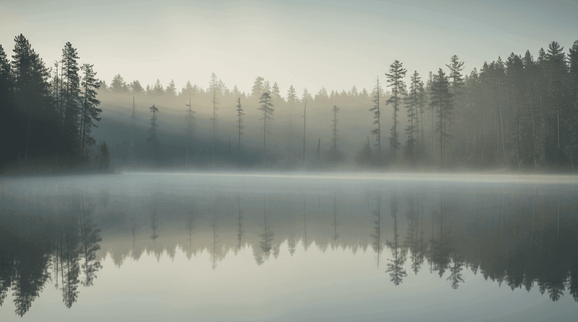
Nature imagery: the oldest cue of safety
There's a reason nearly every calm space — spas, clinics, retreats, the best therapy offices — reaches for nature. Light through leaves. Water. Stone. Soft organic textures. These aren't clichés by accident; they're clichés because they work on something very old in us.
Decades of research in environmental psychology, beginning with Roger Ulrich's landmark hospital study, found that even a view of nature measurably reduces stress and supports recovery. We are, it seems, wired to relax in the presence of natural forms. On a website, you can't offer a real window — but you can offer the next best thing: imagery and palette that carry the same restorative signal.
In practice, this means:
- Muted, earthy palettes — sage, sand, clay, warm greys — rather than clinical white-and-blue or high-contrast brand colours.
- Soft, real photography — natural light, gentle focus, organic textures — over hard, saturated stock imagery.
- Organic shapes — gentle curves and rounded corners rather than sharp, rigid edges that the eye reads as harder, colder, more clinical.
The goal isn't to turn your site into a forest. It's to borrow nature's grammar of safety, quietly, in service of how someone feels while they're deciding to reach out to you.
Pace: the rhythm of reassurance
The third ingredient is the one most easily forgotten, because it doesn't show up in a screenshot. Pace is how the site moves.
A calm website breathes. The scroll is smooth and weighted, not jerky. Content appears at the rhythm of comfortable reading — not all at once in a wall, not painfully slowly. Transitions are gentle and unhurried. Nothing jumps, flashes, or demands. Where another brand might use animation to grab attention, a therapy practice uses it to soothe — a slow fade, a soft settle, the digital equivalent of an even, regulated breath.
The body entrains to rhythm. A frantic pace agitates; a steady one regulates. This is the same reason a therapist's own voice tends to slow and soften in session. Your website should speak at that same tempo.
Where Calm Quietly Breaks
Most therapy websites don't fail loudly. They fail in small, accumulating ways — each one a tiny threat signal the founder never notices, because they've stopped seeing their own site.
Too much, too soon. A homepage that lists every modality, certification and offering in the first screen overwhelms before it reassures. Calm means saying less, and trusting the space around it.
The wrong photography. Bright, posed, smiling stock photos read as a brand performing warmth rather than feeling it. They create the same subtle dissonance as a website that technically works but doesn't feel like you — and prospective clients, who are attuned to authenticity for a living, feel the gap instantly.
Restlessness. Carousels that auto-advance, elements that slide in aggressively, a hero that won't sit still. Movement that wasn't asked for is movement the nervous system has to monitor. And monitoring is the opposite of rest.
Forms that feel like interrogation. The point where someone reaches out is the most vulnerable moment on the entire site. A long, cold, multi-field form at that exact moment can undo every calm signal that came before it. One gentle, human invitation does more than ten required fields.
None of these are catastrophic on their own. But calm is cumulative. It's built from dozens of small decisions all pointing the same way — and broken the same way, one careless element at a time.
Calm Is Not the Same as Empty
A word of caution, because this is where calm design most often goes wrong: restraint is not the same as absence. A site can be so minimal, so washed-out, so afraid of saying anything that it communicates nothing at all — and an environment that gives the nervous system no cues can feel as unsettling as one that gives too many.
Calm still needs warmth. A real face. A human voice in the writing. A point of view. The aim isn't to strip your practice down to a blank, beige nothing — it's to clear away the noise so the things that matter can actually be felt. Space exists to hold something, not to replace it.
The best therapy websites feel less like a clinic and more like a person who is genuinely, quietly present. Steady. Unhurried. There.
- Treat calm as a signal, not a style — for a client in distress, an ordered, spacious environment reads as safety before they consciously decide anything.
- Let whitespace do the heavy lifting — generous space directs the eye, signals confidence, and removes the visual effort your clients can't spare.
- Borrow nature's grammar — muted earthy palettes, soft real photography and organic shapes carry an ancient, restorative cue of safety.
- Set a soothing pace — smooth scroll, gentle transitions and unhurried reveals let the body entrain to a calm rhythm.
- Don't mistake empty for calm — restraint should clear space for warmth and a human presence, never erase them.
The First Session Before the First Session
There's a quiet truth at the centre of all this. By the time a prospective client fills in your contact form, a kind of session has already taken place. Not therapeutic — but relational. They have spent two or three minutes inside the environment you built, and their nervous system has been quietly answering one question the whole time: can I let my guard down here?
Everything we've talked about — the space, the light, the pace, the restraint — is how you help the answer be yes. Not through persuasion, but through felt experience. The same way your room does its work before you ever say a word.
At Orpheus Studio, we build websites that feel like the calmest room in the building — designed so a client's nervous system relaxes before their conscious mind catches up. If you'd like to see what that looks like in practice, explore our psychotherapy concept, where every choice of space, palette and pace is made in service of one feeling: this is a safe place to begin.

