The First Session Begins Before the First Session
Picture someone at 11pm, lit only by a phone screen, typing "psychotherapist near me" with the particular care of a person who has been putting this off for months. They are not browsing. They are gathering the courage to ask a stranger for help.
Your website is the first thing that stranger meets. Not your voice, not your warmth in the room, not the years of training behind your name. A page. Loading in the dark.
And in that moment, before they read a single word about your approach, their body is already deciding something: Is this safe? Can I let my guard down here, even a little?
A website for a psychotherapy practice has a job that no portfolio site or shop ever has. It has to do the one thing therapy itself does first — create enough safety that a person is willing to stay.
Safety Is a Feeling, Not a Feature
We tend to think of safety as something you state. "A safe, judgment-free space." It's on nearly every therapist's homepage, and it's true, and it does almost nothing — because safety isn't a claim the mind accepts. It's a signal the body reads.
This is worth taking seriously, because there's real science underneath it.
Your prospective client's nervous system is doing exactly this while your website loads. A jarring pop-up, an aggressive colour, a stock photo of a model laughing at a salad, a layout that feels loud and busy — these aren't aesthetic missteps. They're threat cues. They tell a body already braced for vulnerability: not here, not now.
The opposite is also true. Stillness, space, soft contrast, a slow and steady rhythm — these read as safety. The visitor can't tell you why the page made them exhale. But they exhale.
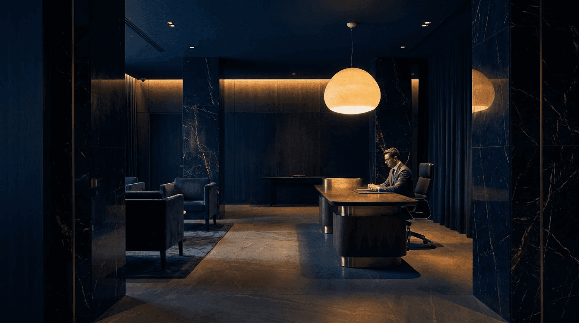
Your homepage is the waiting room. People decide whether to stay in it the same way they decide whether to stay in a real one.
Designing the Digital Waiting Room
Think about the waiting rooms that actually calmed you. They were rarely impressive. They were quiet. Soft light. A chair that didn't ask anything of you. Nothing demanding your attention. That restraint is the design — and it translates directly to a screen.
This is the principle behind Still, one of our concept practices: a psychotherapy site built almost entirely from whitespace, a single calm gesture at a time. Most of the work was deciding what to remove.
Let the page be quiet
The strongest tool you have is empty space. A therapy website does not need to fill every pixel; it needs to leave room. Generous margins, one idea per screen, a single clear path down the page — this is the visual equivalent of a therapist who doesn't rush to fill a silence.
Resist the homepage that tries to say everything at once. Overload is a threat cue. Calm is built from subtraction.
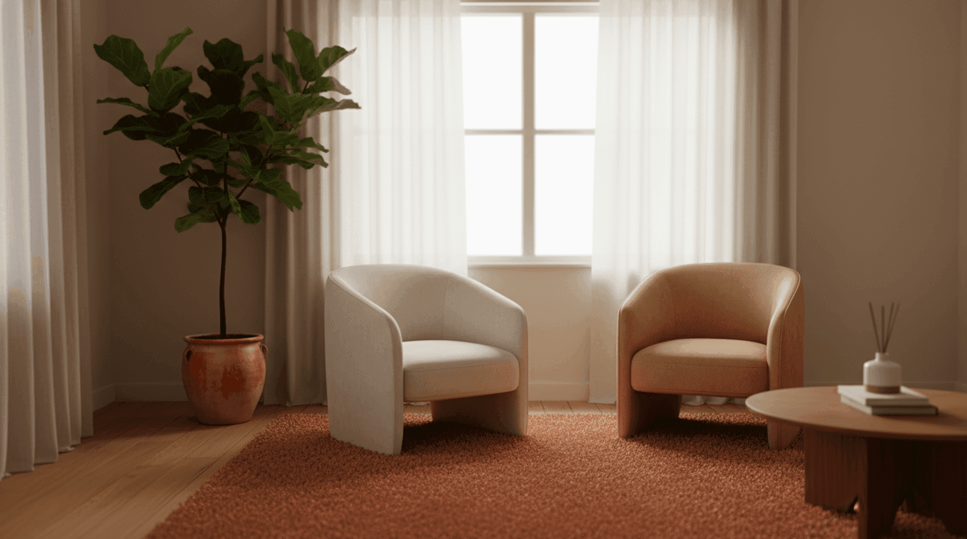
Choose a palette the body trusts
Muted, low-saturation tones — soft sage, warm sand, dusty blue, off-white — sit gently in the visual system. High-contrast, high-energy colour is stimulating by design; it's what conversion-optimised sales pages use precisely because it activates. That is the wrong nervous-system setting for someone deciding whether they can be vulnerable with you. You want the page to lower arousal, not raise it.
Slow the rhythm down
Motion sets pace. Animations that snap and bounce communicate urgency; movement that eases in slowly communicates ease. If your site uses transitions at all, they should feel like a breath, not a notification. And always honour prefers-reduced-motion — some of the people most likely to need your help are most sensitive to visual movement.
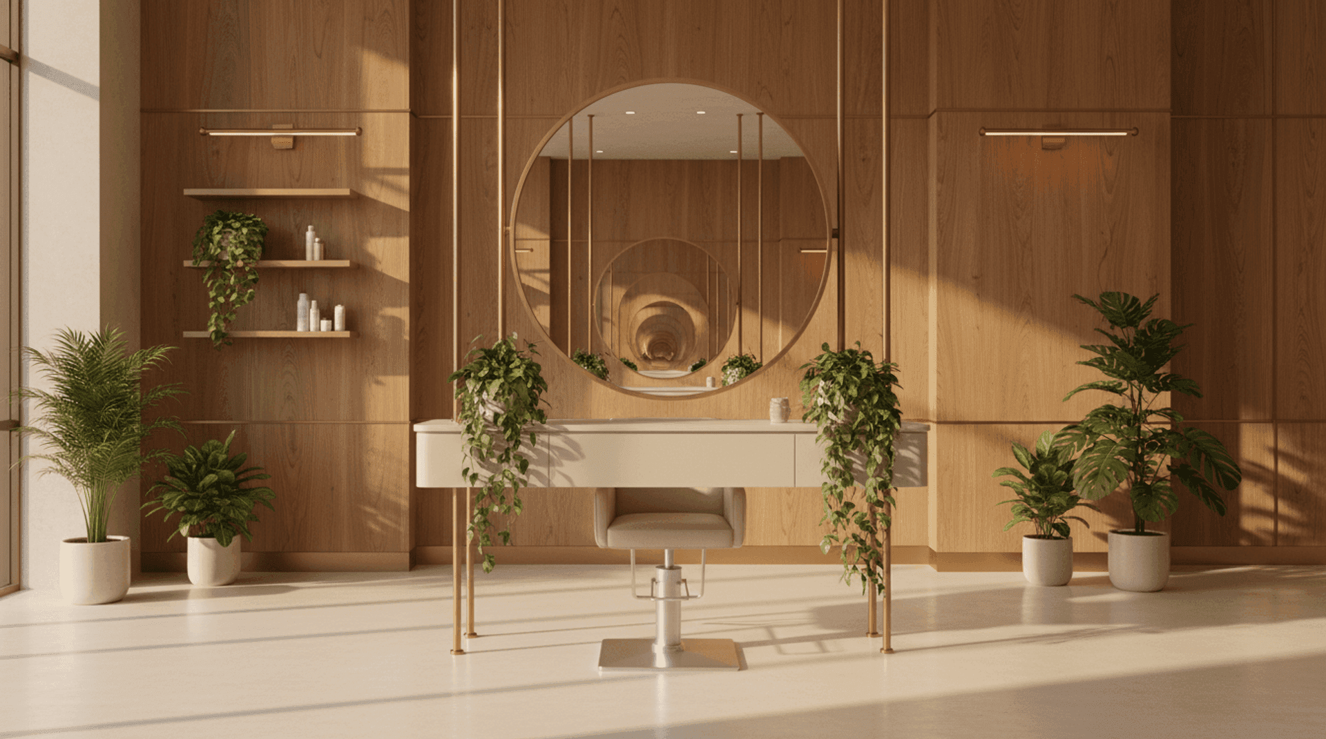
Use real, human imagery — carefully
Avoid the clichés: the disembodied silhouette holding their head, the staged crying, the puzzle-piece-of-the-mind graphic. They feel like stock because they are, and a body reading for authenticity registers that instantly. Real photography of your actual space, of natural light, of a chair by a window, says a real person practises here far more honestly than any metaphor.
If you want to go deeper on the visual language itself — palette, type, texture — we wrote a companion piece on exactly that.
Make Contact the Easiest Thing on the Page
Here is the cruel paradox of a psychotherapy website. The visitor has spent an enormous amount of emotional energy just to arrive. And then, at the exact moment they feel a flicker of readiness, far too many sites make reaching out hard.
A buried contact page. A fourteen-field form demanding their full medical history before a first hello. A phone number as the only option, when calling a stranger is precisely the act this person is dreading. Each of these is a small wall placed in front of someone who was, for one fragile moment, willing to walk through.
The act of making contact should be the gentlest, lowest-effort thing on the entire site.
Offer a low-stakes first step
Asking someone to "book your first session" can feel like asking them to commit to the deep end before they've put a toe in. Offer a smaller doorway: a short message, a free 15-minute introductory call, a simple "ask a question" box. Lower the stakes of the first action and more people will take it. You can always deepen the relationship after the first contact — you cannot deepen one that never began.
Ask for less
Every field in a form is a small ask, and an anxious person reads each one as a reason to close the tab. Name, a way to reach them, and a few lines if they want to share — that's enough to start. You don't need their date of birth and their insurance details at 11pm. You need them to feel that getting in touch was safe and simple.
Be present and reassuring at the point of contact
Right beside the form, tell them what happens next. I'll reply within two working days. Everything you write here is confidential. Uncertainty is a threat cue; a clear, warm next step is a safety cue. This one sentence does more for conversion than any clever headline.
There's a related challenge here worth naming: psychotherapy is one of the few fields where you genuinely can't show client testimonials to build trust the conventional way. Which means the design itself — the calm, the care, the ease of reaching you — has to carry that trust on its own.
- Treats the homepage as a waiting room — calm, quiet, uncluttered, one idea at a time
- Uses muted, low-arousal colour and slow, gentle motion to lower the nervous system rather than activate it
- Replaces stock clichés with honest imagery of a real space and real light
- Makes contact the easiest action on the site, with a low-stakes first step and the fewest possible form fields
- Tells the visitor exactly what happens next, turning uncertainty into reassurance
The Quiet Competence Underneath
None of this is decoration. A calm website is, paradoxically, a deeply technical achievement. The page has to load fast enough that the silence never feels like a stall. The motion has to be tuned so easing curves feel like breathing. The form has to be effortless on a tired thumb at midnight. The whole thing has to be accessible, because the people who need a therapist most cannot be the ones a site quietly turns away.
That's the difference between a template that says "safe space" in a heading and a site that actually produces the feeling. One is a sentence. The other is a hundred small, invisible decisions, each one made on behalf of a nervous system you'll never meet but are already caring for.
Because that's the real work here. Long before someone sits across from you, your website has already begun the therapeutic relationship — or quietly ended it. The kindest thing a psychotherapy practice can do online is make the first step feel safe enough to take.
At Orpheus Studio, we build calm into the code — websites that a visitor's body trusts before their mind has caught up. You can see how we approached exactly this in our Still psychotherapy concept, where the entire design exists to make one person, on one hard night, feel safe enough to reach out.