The Decision Made Before You Speak
Someone has just discovered they're being sued. Or their business partner has vanished with the company accounts. Or a marriage is ending, and there are children. They are frightened, a little ashamed, and they have opened twelve browser tabs at eleven at night. Each one is a law firm. They will choose one of them — and they will mostly decide based on how the websites feel.
That's the strange, uncomfortable truth about a website for a law firm. The person landing on it is rarely calm, rarely an expert, and almost never in a position to judge your actual legal skill. They cannot read your case files. They cannot evaluate your win rate. So they do what humans always do when they can't assess the substance directly: they read the surface for signals of who can be trusted.
Your website is the first conversation. And it happens before you say a single word.
Why Law Is Different From Everything Else
Most of the brands we work with sell a feeling — calm, beauty, transformation. A law firm sells something rarer and more demanding: safety in a moment of fear. Your visitor isn't browsing. They're triaging a crisis. The emotional stakes are higher than almost any other category on the web, and that changes what your site has to do.
A wellness studio website can be warm and exploratory. A law firm website has to be reassuring and certain. The visitor needs to feel, within seconds, three things: these people are serious, these people understand my problem, and I know exactly how to reach them.
A law firm doesn't sell legal services. It sells the feeling that someone competent now has your back.
Get those three signals wrong and it doesn't matter how good your litigation record is. The person closes the tab and opens the next one. Get them right, and you've done something quietly powerful — you've lowered someone's heart rate before they've even picked up the phone.
Authority Is a Design Decision, Not a Headline
Here's the trap most law firms fall into: they try to communicate authority by announcing it. "Leading experts." "Award-winning." "Trusted since 2004." The problem is that anyone can write those words, and your anxious visitor knows it. Claimed authority is weightless. Demonstrated authority is the only kind that lands.
So how do you demonstrate it without saying a word about yourself?
This is why structure carries so much weight in legal design. A page that is calm, ordered, and easy to move through feels like the work of someone whose thinking is calm and ordered. The visitor can't judge your legal mind directly — so they judge the mind that organised the page in front of them. Clutter reads as chaos. Chaos reads as risk. And nobody hands their crisis to someone who feels like a risk.
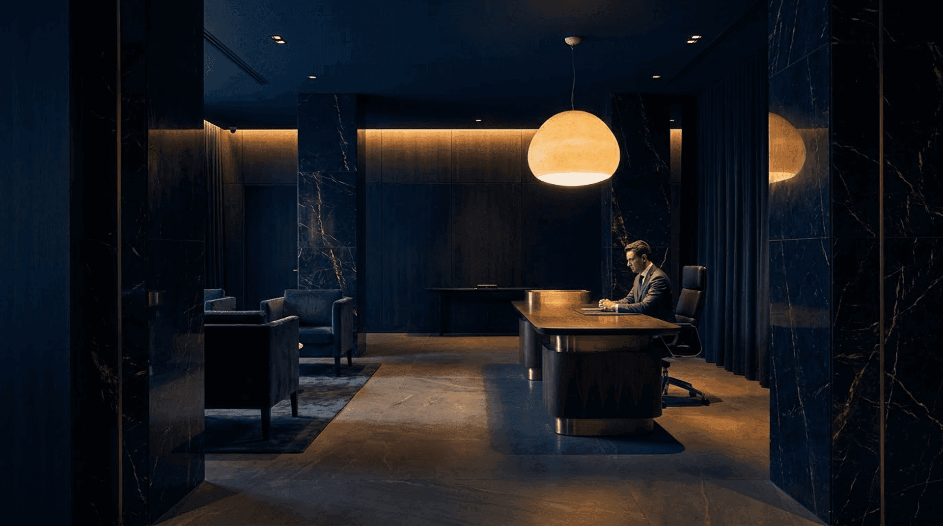
Restraint reads as confidence
Notice how the most respected institutions present themselves. Supreme courts, old universities, private banks. They are almost never loud. They use space generously, type confidently, and colour sparingly. The visual language of authority is quiet, because confidence has nothing to prove. When a law firm site shouts — flashing badges, aggressive reds, six competing calls to action — it signals the opposite of what it intends. It signals desperation.
This is exactly the principle behind the way design controls how a website feels in the body. For a law firm, that felt sense isn't decoration. It's the product.
Structure: The Path Through the Fear
If authority is the feeling, structure is the path. Your visitor arrived overwhelmed. A good legal website doesn't add to the overwhelm — it organises it. It takes a tangled, frightening situation and lays out a clear route through it.
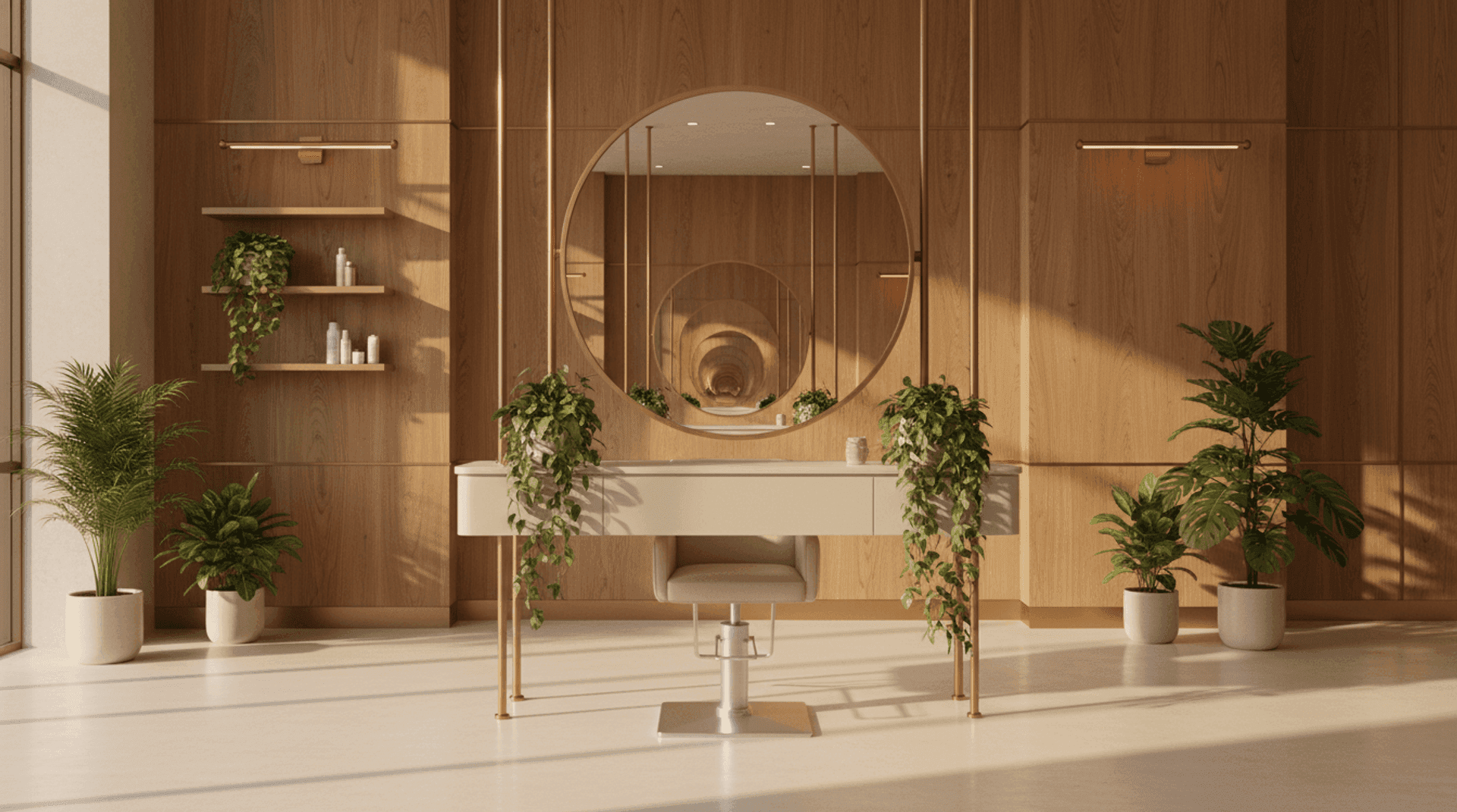
This is the principle behind our Meridian concept — a law firm site built like a broadsheet rather than a brochure. Ruled columns, generous margins, a structured grid that holds everything in place. The layout itself communicates the message: we bring order to messy situations. The visitor doesn't consciously register the grid. They just feel that someone here knows where everything goes.
Good legal structure does three things.
It speaks to the person, not the practice area
Most firms organise their site around themselves — "Litigation," "Corporate," "Family." But your anxious visitor doesn't think in practice areas. They think in problems: my landlord is evicting me, my company is being sued, my marriage is ending. The most reassuring legal sites mirror the visitor's language back to them, so the person instantly sees: yes, they handle exactly my kind of trouble. Recognition is the first relief.
It shows the people
Law is intimate. Someone is about to tell you their worst secret. Faceless firms feel like institutions; named, photographed lawyers feel like people you could actually sit across from. Real portraits — not stock photography — with a short, human bit of writing alongside each one do more for trust than any list of credentials. The credentials confirm competence. The face confirms warmth. You need both, exactly as you do in those first three seconds on any website.
It earns trust without bragging
Law firms have a particular challenge here: client confidentiality means you often can't show glowing testimonials or name the cases you've won. That constraint isn't a weakness — it's an invitation to build credibility in subtler, more durable ways. Published insights, plain-language explainers, a clearly stated approach, recognisable affiliations. These signal expertise without breaching a confidence, and they age far better than a wall of five-star reviews.
The Single Most Forgotten Element: The Way Out
I've reviewed dozens of law firm websites. They get the gravitas right. They get the credentials right. And then, astonishingly often, they hide the one thing the frightened visitor is actually looking for: how do I reach a human, right now?
A contact button buried in the footer. A form that demands fifteen fields before it will let you send a single sentence. A phone number that only appears on a separate "Contact" page three clicks deep. Each of these is a small abandonment of the person at the exact moment they decided to act.
Remember the emotional state. Your visitor is not in a patient mood. The window between "I think I'll call them" and "actually, I'll deal with this tomorrow" is brutally short. Every extra click, every extra form field, is an opportunity for the fear to win and the tab to close. The clearest, calmest path to contact you can possibly build is not a nice-to-have. It is the whole point.
A clear, confident call to action — visible from the first screen, repeated naturally as the visitor scrolls, asking for the minimum to start a conversation — is the difference between a site that looks impressive and one that actually fills your calendar. There is a surprising amount of psychology in getting that one element right.
A Quiet Place in a Loud Moment
Here is the way to think about it. Your visitor's mind is loud right now — racing, catastrophising, exhausted. The most valuable thing your website can offer, before any legal advice at all, is a brief experience of quiet. A page that is ordered, legible, and unhurried. A clear sense of who you are and exactly what to do next.
That quiet is not the absence of design. It's the result of a great deal of it — restrained type, deliberate space, ruthless removal of everything that doesn't serve the frightened person on the other side of the screen.
- Earn trust before it speaks — the anxious visitor judges your competence by how calm, legible, and ordered the page feels
- Demonstrate authority, never announce it — restraint and structure read as confidence; "leading experts" reads as noise
- Organise around the person's problem, not your practice areas — recognition is the first relief
- Show real faces and a clear point of view — warmth and competence together, especially when confidentiality rules out testimonials
- Make the way out unmissable — one clear, low-friction path to contact, visible from the first screen and repeated as they scroll
The firms that win online aren't the ones with the loudest websites. They're the ones whose sites feel, in the visitor's hour of fear, like the first person who finally sounds like they know what to do.
At Orpheus Studio, we build websites that carry authority the way the best lawyers do — quietly, structurally, and without ever raising their voice. If you'd like to see what that looks like in practice, walk through our Meridian law firm concept and notice how the structure does the reassuring for you.